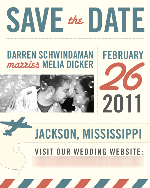
Melia & I had a lot of fun making the save the date. For our wedding, we’re working with a loose international/travel theme. Phrases that are banned include “passport to eternity” and the like. We wanted something fun for the save the dates, and we settled on a sort of “golden age of travel” look.
Colors
Our wedding colors are going to be simple, white and black with red accents. We needed something more festive for the save the date, but not so loud as to distract from our final wedding colors. I really like how this blue & red came out.
Type
My favorite typeface is Trade Gothic Bold Condensed No. 20. If I’m gettin’ married, that typeface is gonna be in there. The scripty font is Santa Fe, which breaks my design teacher’s rule to never use a typeface named after a place. Sorry, Daniela!
Design
The international first class envelope striping on the bottom was a great way to do give it a substantial, hand-held feel since we’re e-mailing the piece. The “Darren Schwindaman marries Melia Dicker” was a (joking) point of contention…but the photo we used had us in that order, and “marries” makes a nice block with Melia’s name because my name’s so long. The photo is from an earlier shoot we’d done with our photographers Adam & Allison Hudson. It’s a great photo that really captures our love. If you’re reading this blog you are honor-bound to contemplate how much Melia & I are in love. Deal with it.


4 responses so far ↓
i can feel the love all the way in hawaii!
seriously, this save the date is gorgeous – love the design, the photo, the whole look.
love the blog too!
Thanks, Tracey!
It turned out really well! Love the colors, theme, typeface.
Oooh- it’s like a behind-the-scenes Extra on a DVD, but cooler! I love hearing the little details behind small but meaningful decisions. <3